The few times I’ve been asked to describe my personal style in the past I’ve responded by, firstly, sighing profusely as if formulating an answer were the most irksome task imaginable, then by making an attempt to string together a few influences that could somehow justify the haphazard car-crash I’ve donned for the day, and finally by spluttering a few incoherent bs sentences that leave the enquirer even more perplexed than they were to begin with.
Swell, then, that I’ve discovered a designer whose aesthetic perfectly encapsulates what I’m all about, sartorially. Satyenkumar Patel graduated from the world-renowned CSM MA course in 2001 before heading Milan-wards to work on Versace‘s mainline collection. I first came across Satyenkumar in London-based design collective Underlining Colours‘ 8th project entitled ‘Brothers’. A menswear-oriented affair, this ‘issue’ saw Satyenkumar’s scarves and outerwear rule the roost in a shoot which also featured menswear-innovators Deryck Walker and Siv Stoldal.
Satyenkumar (jacket on left, scarf on right) in Underlining Colours‘ ‘Brothers‘
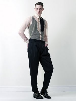
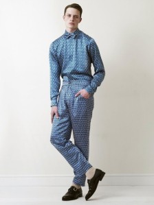
What’s so attractive about this label is its similarity to my own personal style (or rather…what my style – ideally – would be): candy-pinstripe trousers, wide-shorts short-suits (oh, and make like Miuccia says…every day is casual Friday, replace your suit-shirts with polos/tees), bib-fronts and shirt-panels and distintly ‘masculine’ florals i.e. understated, no garish pink, vomit-inducing yellow or green. And that’s just SS09.
Satyenkumar AW09
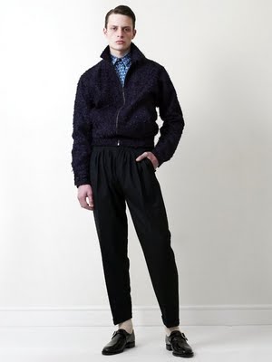
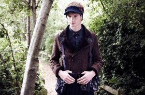
What with retail interest from Daniel Jenkins and Oki-ni (Satyenkumar’s been stocked there for some time but will have renewed presence as part of the ‘New Faces of Menswear‘ initiative) the line’s set to hit hard for AW09. But in a v. genteel fashion, of course. It’s typical AW with dark suiting and outerwear but tastefully flamboyant embellishments flourish, think rose-pink shirts, a satiny-looking overcoat and pyjamas (the Versace influence, perchance?), and royal-blue gauzy gloves/tights-for-hands(?). And yet more panelling, for which I could be only described as gagging…
Images from Underlining Colours, Fashion156, and The Fashionisto


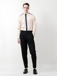
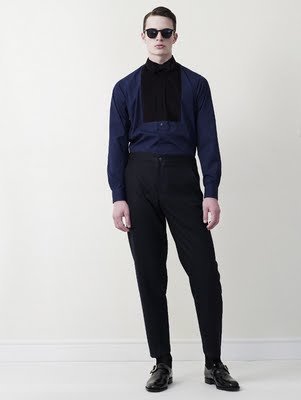
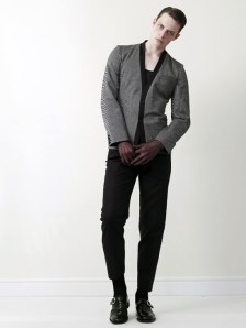
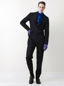
pity, I do enjoy a bit of garish pink and vomiting inducing yellow every once in a while!
i am with Dushka that a little strange color every once and a while is great! this is an interesting lookbook though.not a big fan of the PJs though. but the other looks are quite interesting
Lov the blog and the posts.http://snappylifestyle.blogspot.com/cheerssnappy
Dushka: True that, but only in small doses for Irish skin, I reckon. Now that I think of it these PJs are verging on garish…good garish, of course.Blank Label: Well I'm not sure I'd wear them myself but I just really appreciated a designer's choice to include some classic men's pyjamas/pyjama-inspired-look.Snappy: Much thanks./Male-Mode.com
This comment has been removed by a blog administrator.