I know the chief aim of the generic fashion editorial is to capture the clothing at its most attractive but wouldn’t you agree that the overall image, the combination of striking model, appealing designer wares and captivating location is what really succeeds in selling?
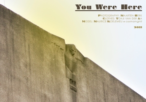
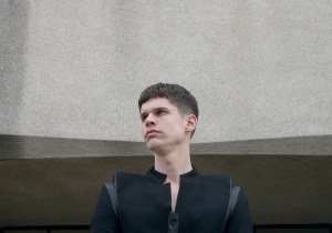
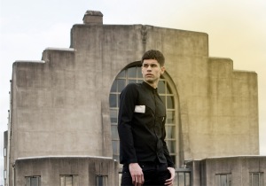
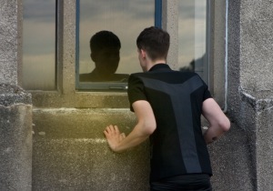
The set for shoots is something so often ignored and yet, for me, it’s integral to an editorial’s visual grab (for want of a better word), which is why I’m pretty chuffed to say that the below editorial, You Were Here, from a group of inspiring Dutch collaborators is an exclusive for this blog.
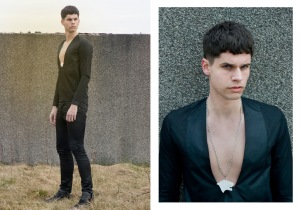
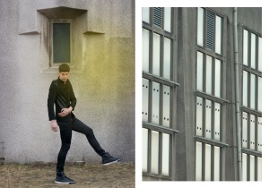
^ Shot in a small Dutch town called Radio Kootwijk (which has just ca. 120 inhabitants and was built back in 1918), the story makes the most of the industrialist ambience by playing designer Yohji van der Aa‘s ascetic silhouette against the futuristic surroundings of the shortwave transmitter site.
I’m a sucker for all things geometric and – as you’ll have noticed yesterday – anything in a shade anywhere from grey to black so I jumped at the chance when model Maurice offered the story.
_________________________________
Where would you shoot the ultimate editorial?
Ooh I really like this.
Super nice editorial! :)http://meesterdapper.blogspot.com/
I like that shirt at the end, with the panelled spine. I'd love to shoot an editorial in Battersea Power Station…probably not that original, but with good sunshine the inside would be a light/shadow dream.
UH. Want this wardrobe. My ultimate editorial would be shot in Manchester's Northern Quarter. The back alleys and fire escapes are do-die.
buffhux.blogspot.com CHECK IT OUT
That is one strangely proportioned model – the legs and arms seem too long for his body… in a cool way, I think 🙂