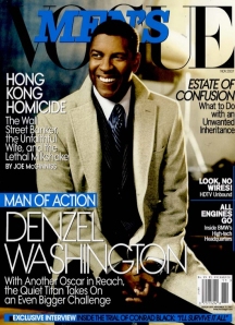
Although I accept Men’s Vogue is a rather conventional men’s magazine and not-overall- a fashion-focused publication I can’t help but feel utter and genuine contempt for the very ugly layout and the a-tad-bland subject material. This may seem totally trivial but I really think the issue should be addressed. I’m sure Conde Nast are quite aware of their target market but don’t they realise that there are American men who are more than a little interested in the sartorial aspect of things? Is it their outright intention to provide a comprehensive and very forward publication-in terms of menswear-for the European market, namely, Vogue Hommes International, and almost entirely neglect the American market in this sense?
Having said all that, Mr.Washington looks his usual dashing self.
Image from TFS

WOW – This is EXACTLY what I said to my BF when we went to the bookstore this weekend! Seriously, I literally held up American Men’s Vogue and Hommes International, and was like, “See the difference?” My BF was shocked and annoyed. Anyway – have you see Esquire’s new Little Black (red) Book? I’m not too keen on that magazine, but it seems like a cool issue.
I JUST WISH THEY WOULD USE MODELS IN THEIR EDITORIALS
yeah – how come ALL the covers have been actors? I guess it’s the same with US women’s Vogue. Vigue just annoys me in general. Too celebrity/society focused…
its pretentious, and no one cares
I can`t possibly think of a man more suitable for the cover – but he should have been grazing it without any text.. great blog!