Amidst hectic prep for last weekend’s garden party (London weather demands excessive consumption of refreshing alcoholic drinks) I received a package I’d been eagerly awaiting. Upon its arrival it was immediately down with the hoover, dusters, and (very) early glass of Pimm’s and onto feasting on fashion illustration at its finest.
Super-talented and all-round sound fashion illustrator, Richard Kilroy, whom I interviewed a while back, has just launched Decoy – a fanzine for fashion illustration, or so Kilroy modestly labels it. Is it just me or does the word ‘fanzine’ conjure connotations of naff material presented in amateurish fashion? Decoy couldn’t be further from such associations. Launched to garner more attention for those working within the area of illustration in fashion publishing, it’s a brief yet highly informative guide to who matters and why within this industry niche.
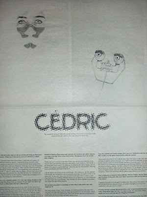
The premier issue features interviews with two of fashion’s top artists: Alex Noble and Cédric Rivrain, two more pop-culture-inclined artists, iri5 and Mr frivolous, as well as an ode to Bruno Pieters, both penned and pencilled by Kilroy himself.
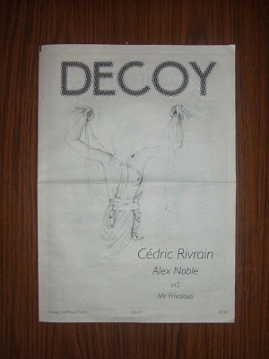
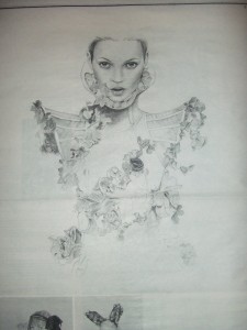
^ The premiere cover featuring a haunting and oh so apt illustration – the mag’s mission statement is to provide ‘visual distraction’.
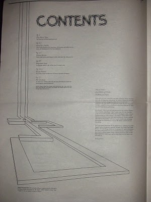
^ Contents page featuring a sketch of the Hugo Boss SS10 show catwalk.
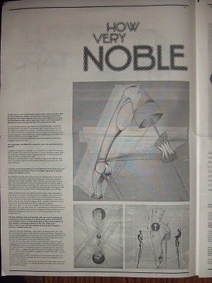
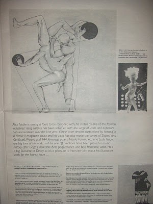
^ An interview with acclaimed designer/stylist/artist, Alex Noble, on Gaga, Art Nouveau and Alexander McQueen’s “seductive rebellious tendencies”.
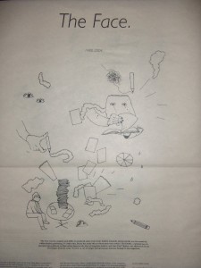
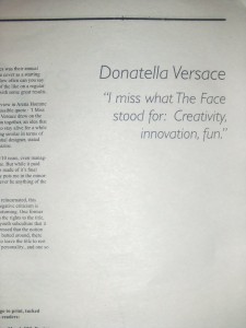
^ A eulogy for The Face

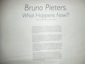
^ A lament for the work of Bruno Pieters whose label is currently ‘resting’. Kilroy has given me good reason to re-discover the past collections of the Belgian designer.
Printed on newspaper in plain black ink, the visual impact is comparable to that of Kilroy’s own illustration work – simple yet boldly arresting. Available online from Richard Kilroy.

wow.. zines should be like this. simple yet looks more presentable. well, that's just my opinion.
it looks so slick and really refreshing to see something so traditional. a dying art i guess
this stunning drawing are making me want to sit down and sketch something!
I love the restraint. Need a copy of this!
Thanks for posting about this, I must get myself a copy. I suppose for some people (myself included)the word 'fanzine' does conjure up amateurishness but I suppose it might also demonstrate encyclopedic knowledge, a passion and drive to tell other people about a certain subject and a fresh approach to publishing at a relatively low cost. Some zines, like this one, look amazing.