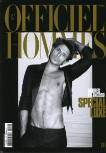
Joy! Finally something to rescue me from wallowing in the depths of cover despair. Granted we’re not presented with anything earth-shattering here but it does make for a respite from the so mind-numbingly boring exteriors of Men’s Vogue[will I ever cease giving them a tough time? Probably not…]
Andres looks impressive to say the least and whoever was on hair managed to effectively maintain the appropriate body-hair-to-skin ratio which of course is a must for any self-respecting modern male, or so we’re told.
The monochrome is perfectly offset by the apt ‘luxe’ of pitch black and gold and sparse lettering-an utter rarity-is always a plus.
Image from TFS


great cover guy!
I AM SCREAMING WITH BLISSSSSSShave you guys seen andres’ poster at H&M, underwear and a robe, woohoo.
Indeed, a fabulous cover!
just discovered this site. interesting, i am quite into fashion so i’ll probably stick around, if that’s ok.anyways great cover!
oh my.
yes much less boring – the magic happens in, as you say, the maintenance of the hair to skin ratio.
Andrés Velencoso…he’s a national icon, actually ha!
WCGUT: I’ve seen the campaign, I concur, smouldering as this cover.James: Welcome to Male Mode! I’d love for you to stick around.
What exactly is for sale in this photo? 😉
we just had our 2nd issue here.:]
heya; seen your posts over on StyleSalvage -your lo e for L’Officiel is shared. It is probably my fav men’s fashion magazine (picturewise at least) and Andres – did you se him in Arena Homme +?
xs: I’m currently hankering after a subscription to the mag. Possibly for Christmas as I’m ghastly restricted budget-wise. I’m afraid I haven’t seen Andres in Arena Homme +..will check it out though.Thanks for visiting.DCB.